
Simply Popups is built natively for the WordPress Block Editor (Gutenberg), allowing you to create and design popups just like you build pages. While the block interface is intuitive, accessing all settings requires understanding the block structure. This guide will walk you through using Simply Popups effectively within the editor.
Note: Some features described in this article require Simply Popups Pro. Pro features are marked with a Pro badge.
Finding the Simply Popups Block
You can add a popup to any page or post using the standard block inserter.
- Open the page or post where you want to add the popup.
- Click the (+) icon to open the block inserter.
- Search for “Simply Popups”.
- Select the Simply Popups block to add it to your content.

Search for “Simply Popups” to add the block to your page.
Understanding Block Structure
The Simply Popups block is actually a parent block that contains two child blocks. Understanding this hierarchy is critical for finding the right settings.
The Hierarchy
- Simply Popups (Parent): Controls trigger type, popup behavior, and close settings.
- Simply Popups Button (Child): Controls the button text and style (if using a button trigger).
- Simply Popups Content (Child): Controls the modal window appearance and inner content.
How to Select the Parent Block
Because the button and content blocks are nested inside, it can be tricky to select the main “Simply Popups” parent block to access trigger settings. Use one of these three methods:
- Document Overview (List View): Click the Document Overview icon (three staggered lines) in the top toolbar to see the document structure. Select “Simply Popups” from the list.
- Toolbar Icon: Click on the Button or Content block, then click the Simply Popups icon on the far left of the block toolbar to select the parent.
- Click Between Blocks: Carefully click in the empty space between the button and the modal content area.
If you don’t see “Trigger Type” or “Close Button” settings in the sidebar, you likely have a child block selected instead of the parent block.
Modal Block Settings Overview
When the parent block (Simply Popups) is selected, the sidebar settings control the overall popup behavior.
Select the parent block to configure triggers and close options.
Key Settings:
- Trigger Type Pro: Choose how the popup opens (Button Click, Page Load, Exit Intent, etc.). Lite users have Button Click only.
- Close Button: Toggle the “X” close button on/off.
- Click Outside to Close: Choose whether clicking the background overlay closes the popup.
- Dimensions: Set the maximum width and height of the modal.
Dynamic Block Structure
The elements visible in the Document Overview change based on your Trigger Type.
- Button Click: A Simply Popups Button block appears. This allows you to customize the button text and style.
- Link Click Pro: A Simply Popups Link block appears. You can edit the link text and color settings.
- Image Click Pro: An Image block appears. You can upload or select an image from your library.
- Page Load / Exit Intent / Delayed Pro: No trigger block is shown. Since these trigger automatically, only the Simply Popups Content block remains visible.
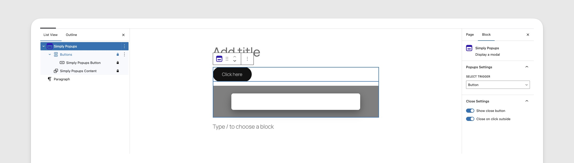
The Document Overview showing the button element when the Button trigger is selected.
Button Block Settings
When the Simply Popups Button block is selected, the sidebar controls the appearance of the trigger button.
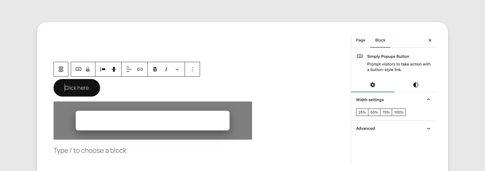
Customize your trigger button’s style, color, and typography.
Key Settings:
- Style: Choose between Fill (solid color) or Outline (border only) styles.
- Typography: Adjust font size, weight, and case.
- Colors: Set text and background colors for normal and hover states.
- Border Settings: Adjust border width and radius (rounded corners).
- Width: Set the button to a fixed width or 100% width.
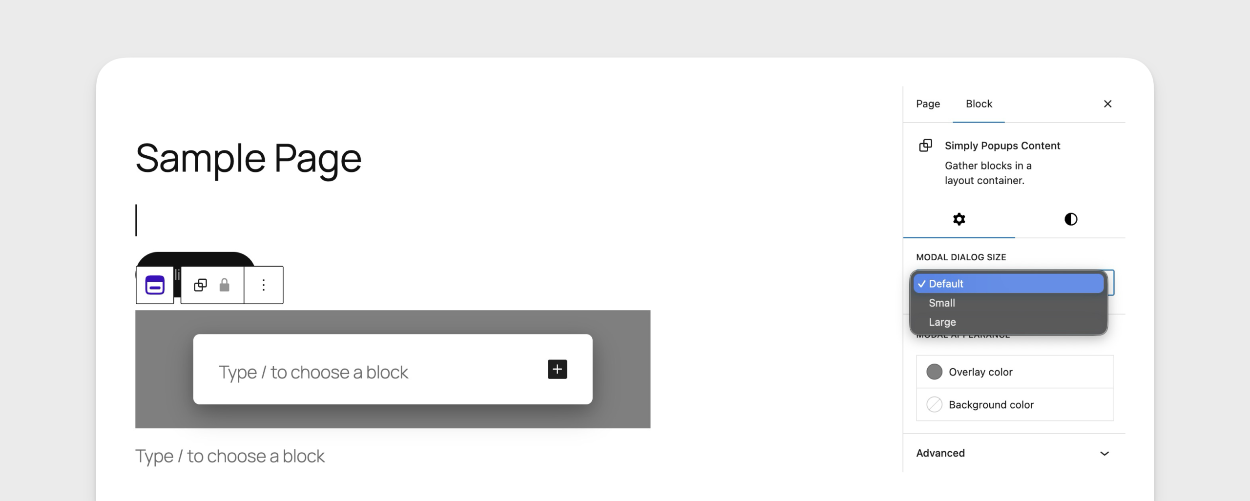
Content Block Settings
When the Simply Popups Content block is selected (the area inside the modal), the sidebar controls the modal’s styling.
Style the interior of your popup including background and overlay.
Key Settings:
- Background Color: Set the background color of the modal window itself.
- Text Color: Set the default text color for content inside the popup.
- Overlay Color: Customize the color and opacity of the screen overlay (the dark background behind the popup).
- Modal Size: Quickly switch between Small, Default, and Large presets.
- Padding: Control the spacing inside the modal window.
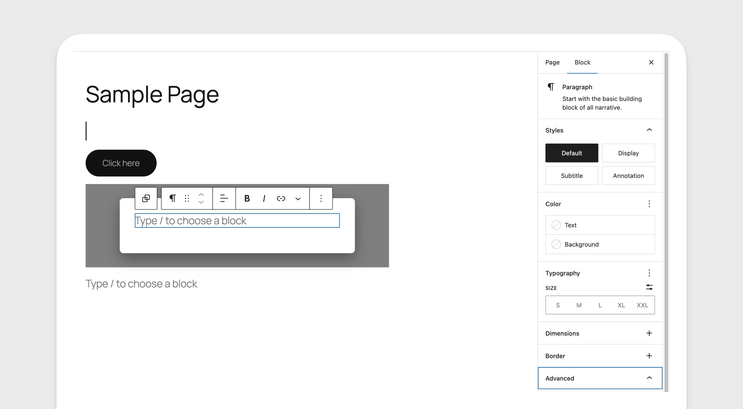
Adding Content to Your Popup
The content area of Simply Popups functions like a standard Group block. You can add almost any WordPress block inside it.
- Click the (+) icon inside the popup content area.
- Add headers, paragraphs, images, or even other plugins.
You can drag and drop existing blocks from your page into the popup content area.
Alternative: Using Shortcodes
While the Block Editor is the recommended way to use Simply Popups, shortcodes provide a flexible alternative for using popups in other page builders, widgets, or directly in the Classic Editor.
The [simply-popups] Shortcode
The primary shortcode for creating popups is [simply-popups]. This shortcode creates both the trigger (link or button) and the modal content itself.
Basic Syntax
[simply-popups label="Click Me"]
Your popup content goes here.
[/simply-popups]
This will create a link with the text “Click Me”. When clicked, a popup will appear containing “Your popup content goes here.”
Parameters
The shortcode accepts several parameters to customize the behavior and appearance of the popup.
| Parameter | Description | Default |
|---|---|---|
label | The text for the trigger link. Also used as the modal title if modal_title is not specified. | (Empty) |
modal_title | The text displayed in the header of the popup window. | Defaults to label |
class | CSS class(es) added to the trigger link. | (Empty) |
modal_class | CSS class(es) added to the modal container. | (Empty) |
size | Controls the width of the popup. Options: small, large. | (Standard) |
button_html | Allows you to use custom HTML for the trigger instead of a standard link. | (Empty) |
no_click_outside | If set to 1, prevents the popup from closing when clicking the background (backdrop). | (Empty) |
hide_close | If set to 1, hides the “X” close button in the header. | (Empty) |
Examples
1. Basic Text Link
Create a simple text link that opens a popup.
[simply-popups label="Open Popup"]
    <h2>Hello!</h2>
    <p>This is a simple popup content.</p>
[/simply-popups]
2. Large Popup with Custom Title
Create a wider popup with a specific title different from the trigger text.
[simply-popups label="View Terms" modal_title="Terms and Conditions" size="large"]
    <p>Here are the full terms and conditions...</p>
[/simply-popups]
3. Custom Trigger Button
Use your own HTML button as the trigger. This is useful if you want to style the trigger to look like a button or use an image.
[simply-popups label="Contact Us" button_html='<button class="my-custom-btn">Contact Support</button>']
    [formidable id=1]
[/simply-popups]
When using button_html, the label is still used as the fallback title for the modal if modal_title is not provided.
4. Persistent Popup (No Outside Click Close)
Create a popup that forces the user to interact with it or use the close button, preventing accidental closure by clicking the background.
[simply-popups label="Important Notice" no_click_outside="1"]
    <p>You must acknowledge this message.</p>
[/simply-popups]
Legacy Support
The plugin also supports the and shortcodes for compatibility with Formidable Forms modal implementations. These function identically to [simply-popups].
[frmmodal label="Legacy Popup"]
    Legacy content works too!
[/frmmodal]