
Simply Popups provides extensive styling options to ensure your popups perfectly match your website’s design theme. This comprehensive guide covers everything from button styling to modal appearance, close button settings, and advanced custom CSS.
Table of Contents
Button Styling
The trigger button is often the first thing users interact with, so getting its appearance right is crucial for conversions.
Accessing Button Settings
- In the Block Editor, select the Simply Popups Button block.
- Tip: If you can’t click it directly, use the Document Overview (List View) to select “Simply Popups Button”.
- Open the Settings sidebar on the right.
The button settings panel allows for complete visual customization.
Button Styles
You can customize the button appearance using the Styles tab (half-circle icon) in the sidebar.
Creating a “Fill” Style (Solid)
This is the standard button look.
- Set a Background Color.
- Set a contrasting Text Color (e.g., White text on Blue background).
- Remove any Border settings if not needed.
Creating an “Outline” Style (Ghost Button)
This style has a transparent background with a colored border.
- Set Background Color to transparent (or clear).
- Set Text Color to your desired color (e.g., Blue).
- Under Border & Shadow, set the Border width (e.g., 2px) and choose the same color as your text.
Color Customization
You can independently style the button for its normal state and its hover state (when a user moves their mouse over it).
Normal State
- Text Color: The color of the button label.
- Background Color: The solid color of the button (for Fill style).
Hover State
- Text Color: Change the text color on hover.
- Background Color: Change the background color on hover.
Design Tip: For a professional look, make the hover color a slightly darker or lighter version of your main color.
Typography Settings
Control the text appearance of your button label:
- Size: S, M, L, XL, or a custom pixel value.
- Appearance: Bold, Italic, or standard weight.
- Letter Case: Force text to Uppercase, Lowercase, or Capitalize.
Shape and Size
Border Radius
This controls how round the button corners are.
- 0px: Sharp, square corners.
- 5-10px: Slightly rounded corners (modern standard).
- 50px: Fully rounded “pill” shape.
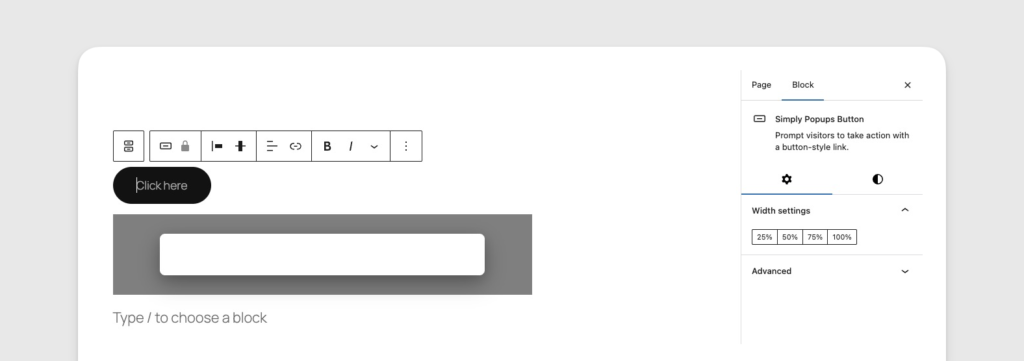
Width Settings
You can set the button width using the provided presets:
- 25%: One-quarter width.
- 50%: Half width.
- 75%: Three-quarters width.
- 100%: Full width (great for mobile).
Advanced Settings
In the Advanced accordion, you can add:
- Additional CSS Classes: For custom styling.
- Link Rel: To define the relationship between the current document and the linked document.
Known Limitations
- Drop Shadow: In some browser versions, the button drop shadow may not perfectly follow the
border-radius(appearing square behind a rounded button). If this happens, try reducing the shadow intensity. - Default Shape: The default button shape may vary slightly between the Lite and Pro versions due to different stylesheet priorities. Always check your button in the live preview.
Modal Styling
The appearance of your popup (modal) is crucial for user experience. A well-styled popup feels like a natural part of your website, while a poorly styled one can look like spam.
Accessing Modal Settings
The styling settings for the modal window are located in the Simply Popups Content block.
- Click inside your popup content area.
- Ensure Simply Popups Content is selected in the sidebar or Document Overview.
- View the Settings sidebar.
Use the content block settings to style the modal window and overlay.
Modal Window Styling
This controls the box that contains your content.
Size Presets
Choose a preset width for your popup:
- Small: Best for simple alerts or single-field forms.
- Default: A balanced width suitable for most content.
- Large: Best for complex layouts, columns, or videos.
Background Color
Set the background color of the modal window itself.
- White (#ffffff) is the standard choice for readability.
- Dark/Black backgrounds can look sleek but require light text colors.
- Brand Colors can be used for high-impact announcements.
Padding
Padding is the empty space between the edge of the modal box and your text/content.
- Default Padding: Usually sufficient for basic text.
- Increased Padding: Recommended if you are using a background color or borders, to give content “room to breathe.”
Overlay Settings
The overlay is the screen background that covers your website content while the popup is open.
Overlay Color & Opacity
- Color: Usually black or a dark gray.
- Opacity: Determines how transparent the overlay is.
- High Opacity (Darker): Focuses more attention on the popup.
- Low Opacity (Lighter): Keeps the underlying page more visible.
Don’t make the overlay 100% opaque (solid color). Users might think they’ve left your site. Keeping the background page slightly visible reassures them.
Typography Defaults
You can set default typography settings for all text inside the popup.
- Text Color: Sets the default color for paragraphs and headings (unless overridden by individual blocks).
- Font Family: Inherits from your theme by default, but can be customized.
- Font Size: Sets the base size for text.
Responsive Design
Simply Popups is mobile-responsive out of the box.
- On Mobile Devices, the modal automatically adjusts to fit the screen width with appropriate margins.
- Scroll: If your content is taller than the screen, the modal becomes scrollable so users can reach all content and the close button.
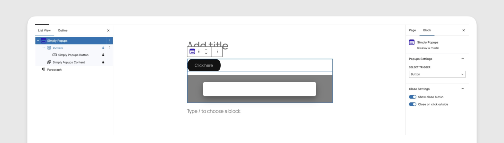
Close Button Settings
Providing a clear way to close a popup is essential for user experience and accessibility. Simply Popups offers two primary methods for users to dismiss a modal: a visual “X” close button and clicking the background overlay.
Accessing Close Settings
Close settings are controlled by the Parent Block (Simply Popups).
- Select the Simply Popups block (use the Document Overview if needed).
- Look at the Settings sidebar.
Close options are located in the parent block settings.
The Close Button (X)
Show/Hide Close Button
- Toggle ON: Displays an “X” icon in the top-right corner of the modal.
- Toggle OFF: Hides the icon.
If you hide the close button, you must ensure “Click Outside to Close” is enabled, or provide your own custom close button/link inside the content. Otherwise, users may be trapped in the popup.
Customizing the Close Icon
Currently, the close icon styling (color, size) inherits from the plugin’s default styles to ensure accessibility and contrast.
- Color: Automatically contrasts with the modal background.
- Position: Fixed to the top-right corner of the modal container.
Click Outside to Close
This feature allows users to dismiss the popup by clicking anywhere on the dark background overlay surrounding the modal.
- Toggle ON (Recommended): Standard behavior for web modals. It feels intuitive for users.
- Toggle OFF: The popup stays open even if the background is clicked.
When to Turn OFF:
- If you have a mandatory form (e.g., Age Verification).
- If you want to force the user to interact with the popup content specifically.
Keyboard Accessibility
Simply Popups is built with accessibility in mind.
- ESC Key: Pressing the
Escapekey on a keyboard will automatically close the popup, regardless of the visual button settings. This is a browser standard and cannot be disabled.
Troubleshooting
Close Button Not Visible?
- Check if the toggle is set to ON.
- If the modal background is white and the close button is white, it may be invisible. Try changing the modal background color.
- On mobile, ensure your content isn’t pushing the close button off the screen area.
Custom CSS Reference
While Simply Popups provides visual controls for many styling options, you may sometimes need to apply custom CSS for advanced design requirements. This guide documents the HTML structure and CSS classes used by the plugin.
HTML Structure
The basic structure of a Simply Popups modal looks like this:
<div class="simply-modal-overlay">
    <div class="simply-modal simply-modal-size-default">
        <div class="simply-modal-content">
            <button class="simply-modal-close" aria-label="Close">
                <span class="simply-close-icon">×</span>
            </button>
            <div class="simply-modal-body">
                <!-- Your Block Content Goes Here -->
            </div>
        </div>
    </div>
</div>
CSS Classes Reference
Use these classes to target specific parts of the popup in your theme’s style.css or the Customizer (Appearance → Customize → Additional CSS).
Main Container & Overlay
| Class Name | Description |
|---|---|
.simply-modal-overlay | The dark background that covers the entire screen. Handles the z-index and background color/opacity. |
.simply-modal | The wrapper for the modal window itself. Handles positioning (centering) on the screen. |
.simply-modal-open | Added to the <body> tag when a popup is open. Useful for preventing page scrolling. |
Example: Change Overlay Z-Index
/* Ensure popup appears above everything else */
.simply-modal-overlay {
    z-index: 99999 !important;
}
Modal Window
| Class Name | Description |
|---|---|
.simply-modal-content | The actual box containing your content. Handles background color, border radius, and padding. |
.simply-modal-size-small | Applied when “Small” size is selected. |
.simply-modal-size-default | Applied when “Default” size is selected. |
.simply-modal-size-large | Applied when “Large” size is selected. |
Example: Add a Drop Shadow
.simply-modal-content {
    box-shadow: 0 10px 25px rgba(0,0,0,0.5);
    border: 2px solid #333;
}
Close Button
| Class Name | Description |
|---|---|
.simply-modal-close | The button element itself. Positioned absolute in the top-right corner. |
.simply-close-icon | The span containing the “×” character. |
Example: Move Close Button Outside
.simply-modal-close {
    top: -40px;
    right: -40px;
    color: #ffffff;
}
Content Area
| Class Name | Description |
|---|---|
.simply-modal-body | The container for your inserted blocks. |
Targeting Specific Popups
If you have multiple popups and want to style only one of them, you can add a custom class in the Block Editor.
- Select the Simply Popups block.
- Expand the Advanced section in the right sidebar.
- Add your class to Additional CSS Class(es) (e.g.,
my-special-popup).
This class is added to the outer wrapper. You can then target it like this:
/* Only affects the popup with "my-special-popup" class */
.my-special-popup .simply-modal-content {
    background-image: url('confetti.png');
}
Trigger Buttons
If you are using the Button Trigger, standard classes apply to the button element.
| Class Name | Description |
|---|---|
.wp-block-simply-popups-button | The main button element. |
.is-style-outline | Added if “Outline” style is selected. |
.is-style-fill | Added if “Fill” style is selected (default). |
Example: Hover Effect
.wp-block-simply-popups-button:hover {
    transform: translateY(-2px);
    box-shadow: 0 4px 8px rgba(0,0,0,0.1);
}