
The Button Click trigger is the default and most common way to display popups. It allows visitors to open a modal on demand by clicking a customizable button on your page. This manual trigger is perfect for non-intrusive offers, contact forms, and “read more” content.
Lite Feature: The Button Click trigger is the only trigger type available in the free version of Simply Popups. Other triggers (Page Load, Exit Intent, Link, Image) require Simply Popups Pro.
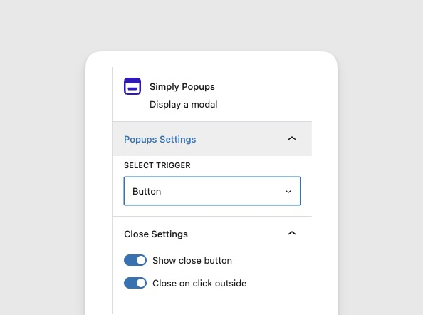
How the Button Click Trigger Works
When you select the Button Click trigger, Simply Popups displays a button block on your page. The popup remains hidden until a visitor clicks this button.
- User Control: Visitors choose when to engage.
- Zero Annoyance: Does not interrupt the browsing experience.
- Versatile: Can be styled to match any theme.
- Free Feature: Available in Simply Popups Lite.
Setting Up a Button Trigger
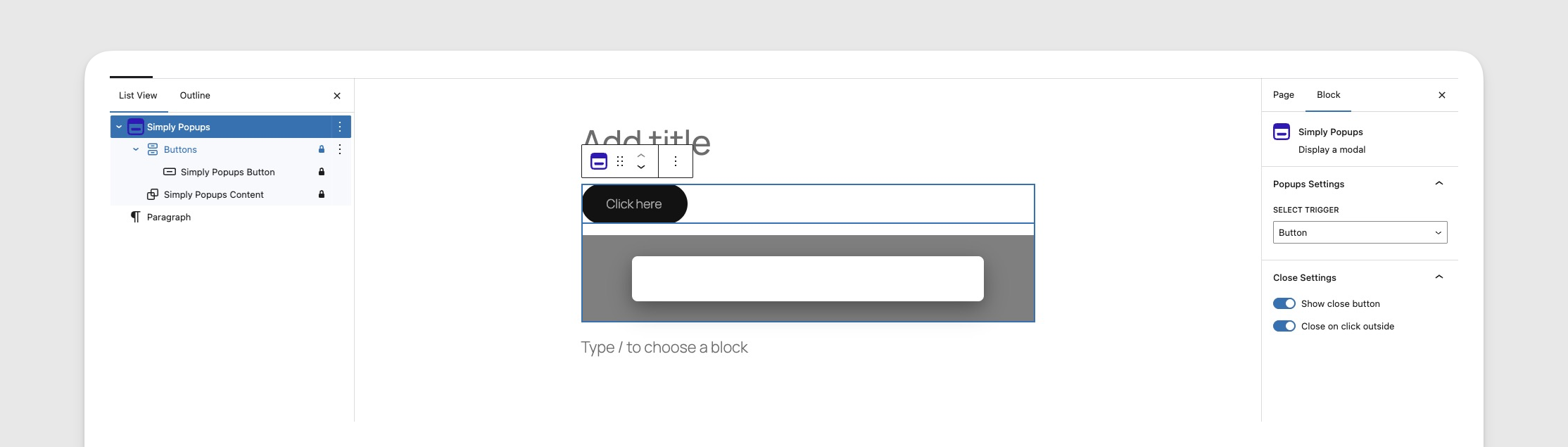
By default, new Simply Popups blocks use the Button Click trigger.
- Add the Simply Popups block to your page.
- Select the parent Simply Popups block.
- In the sidebar settings, ensure Trigger Type is set to Button Click.
- You will see a button appear next to or above your popup content in the editor.
Ensure “Button Click” is selected in the Trigger Type settings.
Customizing Button Text
You can edit the button text directly in the editor, just like a paragraph.
- Click on the button element inside the Simply Popups block.
- Type your desired text (e.g., “Get Coupon”, “Contact Us”, “Read More”).
- You can use standard text formatting like bold or italic from the toolbar.
Customizing Button Appearance
Simply Popups provides extensive styling options to make your trigger button match your site’s design.
- Select the Simply Popups Button block.
- Open the Settings sidebar on the right.
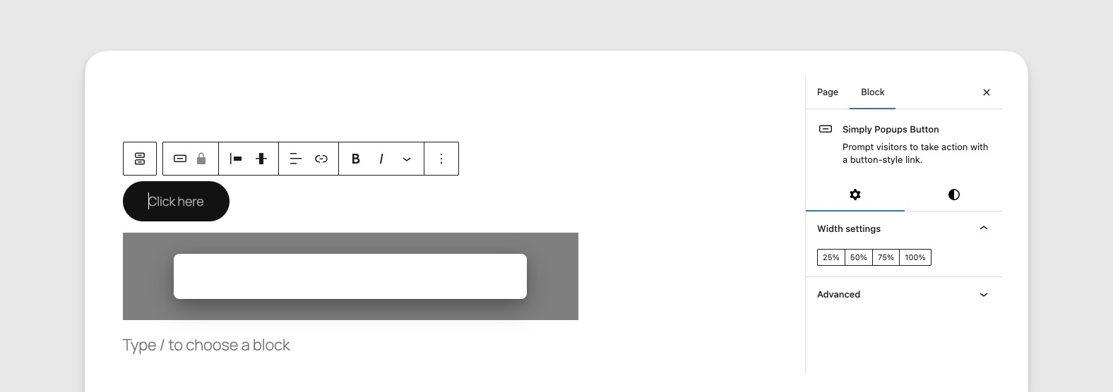
Customize your button’s style, color, and dimensions in the block sidebar.
Style Options
- Fill: A solid background color (standard button style).
- Outline: A transparent background with a colored border (ghost button style).
Styling Controls
- Typography: Adjust the font size, weight, and letter spacing.
- Colors: Set custom text and background colors for both Normal and Hover states.
- Border Radius: Control how round the button corners are (0 for square, 50 for pill-shaped).
- Width: Toggle between auto-width (based on text) or full-width (100% of container).
Best Practices for Button Triggers
- Clear Labeling: Use action-oriented text like “Sign Up Now” rather than just “Click Here”.
- Contrast: Ensure your button stands out from the surrounding content.
- Placement: Place buttons near relevant context (e.g., a “Size Guide” button next to product options).
- Mobile Friendly: Use the 100% width option on mobile to make buttons easier to tap.